Qawine Again: A Bold Display Font for Digital Brand Impact
As a UI designer who ships landing pages, SaaS dashboards, and conversion-focused e-commerce experiences, I don’t reach for display fonts lightly. They need to earn their place—not just look striking in a mockup, but hold up across devices, reinforce brand tone, and guide the eye without sacrificing clarity. Qawine Again is one of those rare display fonts that delivers both personality and precision.
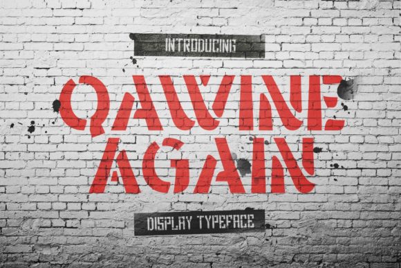
Visually, Qawine Again is cool, bold, and assertive—structured enough to feel intentional, expressive enough to feel human. It’s not a script or handwritten font, nor is it minimalist or geometric. Instead, it occupies a confident middle ground: strong letterforms with subtle flair, generous x-height, and open counters that maintain legibility even at smaller sizes. Its PUA encoding means every swash, alternate, and stylistic glyph is accessible directly in design tools like Figma or Adobe XD—no workarounds, no character map hunting.
In real-world web layouts, Qawine Again shines where hierarchy and voice matter most. Think hero section headlines on product landing pages—especially for creative agencies, coaching brands, or premium online stores. Its presence immediately signals confidence and differentiation. On a boutique skincare site, it works beautifully over soft image overlays; on a developer tool’s homepage, it adds warmth without undermining technical credibility. Because it’s designed as a display font, it’s best deployed for short, high-impact text: H1s, section headers, CTA buttons (“Get Started”, “Join the Waitlist”), testimonial quotes, and branded banners.
It’s not ideal for body copy or long paragraphs—and that’s by design. Pairing Qawine Again with a clean, highly readable sans serif (like Inter, Manrope, or even system fonts like -apple-system) creates a balanced, professional rhythm. That contrast supports scanning behavior: users land on the bold headline, absorb the core message, then move smoothly into supporting content. For editorial or portfolio sites leaning into sophistication, try pairing it with a restrained serif like Lora or Playfair Display—but keep line height and letter spacing generous to avoid visual clutter.
On mobile, Qawine Again holds up well when used intentionally. I recommend minimum sizes of 28px for H1s on portrait viewports, with tracking adjusted slightly looser (+20–40 units) to preserve spacing between characters. Avoid stacking multiple lines of Qawine Again in tight vertical spaces—its assertiveness gains impact through breathing room. For dark mode interfaces, test contrast carefully: its medium stroke weight reads cleanly against deep charcoal or navy, but may require slight weight adjustment or background opacity tweaks when overlaid on photos.
One practical strength is its adaptability across digital touchpoints. Use it consistently across your website, email headers, social media cover graphics, and digital ad creatives—and you begin building a cohesive, ownable visual language. A course creator might use Qawine Again for module titles and “Enroll Now” buttons, while keeping body text in a neutral sans. A freelance designer’s portfolio could feature it in the hero banner and project thumbnails, reinforcing creative authority without overwhelming the work itself.
When evaluating display fonts for client work or product launches, licensing is non-negotiable. Qawine Again is a commercial font, meaning it requires proper licensing for web use—including self-hosted @font-face declarations, CMS integrations, and template distribution. If you’re embedding it on an online store, SaaS platform, or client website, verify the license covers WOFF2 delivery, unlimited pageviews, and multi-domain usage. Never rely on free “demo” versions for production—they often lack full glyph sets, lack PUA support, and violate terms when deployed live.
It also matters what’s included beyond the base style. Qawine Again offers alternates and swashes that aren’t just decorative flourishes—they’re functional tools. That upward flick on the capital “Q”? Perfect for logo lockups or monogrammed assets. The extended terminal on the lowercase “a”? Adds rhythm to short taglines. These details become part of your brand’s micro-language—reinforcing consistency across web, app, and social visuals.
For designers building digital-first brands, typography isn’t decoration—it’s architecture. Every font choice shapes how users perceive trust, innovation, approachability, or authority before they read a single word. Qawine Again doesn’t whisper. It states. And because it does so with structural integrity and thoughtful spacing, it avoids the pitfall of many bold display fonts: looking loud but empty. Instead, it carries weight *and* intention.
If you’re refreshing a brand kit, launching a new product, or redesigning a high-conversion landing page, consider where a decisive typographic voice can elevate clarity and connection. Qawine Again works especially well when your audience values authenticity over austerity, creativity over conformity, and clarity over cleverness. It’s not for every project—but when it fits, it anchors the entire experience.
Finally, remember that great typography serves the user first. Test Qawine Again with real content—not just “Lorem ipsum”—and observe how it behaves with your actual headlines, CTAs, and navigation labels. Does it improve scanning speed? Does it align with your brand’s spoken tone? Does it scale gracefully from desktop hero to mobile banner? When the answers are yes, you’ve found more than a font—you’ve found a strategic design asset.