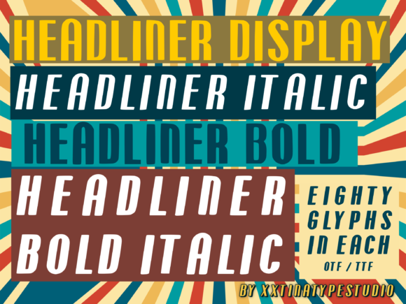
Headliner: A Modern Display Font for Confident Digital Headlines
Yesterday, I dropped Headliner into the hero section of a new coaching website — not as a placeholder, but as a deliberate choice. The client wanted something warm yet authoritative, approachable but unmistakably professional. We’d tested three other display fonts: one too playful, one too rigid, one that lost clarity at 32px on mobile. Then came Headliner.
It’s an all-caps sans serif with softly rounded geometrical edges — not bubbly, not cold, just quietly confident. Think clean signage meets contemporary branding: friendly enough for a wellness coach’s headline (“You Belong Here”), sharp enough for a product landing page banner (“Launch Your First Course”). It doesn’t shout — it settles in, like a well-placed accent light.
I used it for the main headline, subhead (in a lighter weight), and even the primary CTA button text. On desktop, it held strong against a subtle gradient background. On mobile? Still legible at 28px — no letter collisions, no awkward spacing between “A” and “V”, no rounding that blurred into ambiguity. That’s rare in all-caps display fonts. Many sacrifice readability for flair; Headliner balances both.
What makes it work so well in real layouts? First, its geometry is consistent but humanized — corners are rounded just enough to soften rigidity without losing structure. Second, the letterforms breathe: generous counters, open apertures, and balanced stroke contrast. That means it scales cleanly across devices and remains scannable in fast-scrolling contexts — especially important for landing pages where users decide in under three seconds whether to stay or bounce.
In practice, I’ve found Headliner shines brightest where attention needs direction: hero titles, section headers (“How It Works”, “What Clients Say”), campaign banners, shop category labels, and digital brand kits. It’s not built for paragraphs — and that’s intentional. As a display font, its role is hierarchy, not utility. Use it for short, high-impact phrases. Avoid long sentences or dense navigation menus. For buttons, keep them concise (“Get Started”, “Join Now”) — the rounded caps add visual friendliness without sacrificing clarity.
Pairing matters. I paired Headliner with Inter for body copy — a neutral, highly readable variable sans serif. The contrast works beautifully: Headliner brings character and brand voice; Inter delivers quiet reliability. For a more editorial feel — say, on a course sales page with long-form testimonials — a restrained serif like IBM Plex Serif also complements Headliner’s geometry without competing. The key is contrast with harmony: one font sets tone, the other supports understanding.
Readability checks were non-negotiable. I tested it over image overlays (using a subtle darkening filter), on both light and dark mode backgrounds, and inside cards with soft shadows. At 40px on a 16:9 hero banner, it remained crisp — no hint of pixelation or font-rendering blur, even on older Android devices. On iOS Safari, the rounding stayed smooth. No webfont hiccups either: the WOFF2 files loaded quickly, and the variable weight axis gave me precise control without bloating the page.
Before deploying, I double-checked licensing — yes, it includes commercial use, web embedding, and unlimited domains. It supports Latin Extended-A, so accented characters (é, ñ, ü) render cleanly across English, Spanish, French, and Portuguese content. No surprises there. And while it doesn’t include italics or stylistic alternates, that’s fine: Headliner isn’t meant to be flexible in form — it’s meant to be consistent in impact.
Where else have I seen it land well? A boutique online store used it for seasonal campaign banners (“Summer Edit”, “New Arrivals”) — the rounded edges softened the premium aesthetic without undermining sophistication. A creative portfolio site used it only for the logo lockup and project titles, letting the work breathe while still anchoring the brand visually. A blog redesign used it sparingly: just the masthead and featured post headlines — enough to signal a fresh, intentional identity without overwhelming the writing.
One note on implementation: avoid stretching or distorting Headliner with CSS transforms. Its rhythm depends on native spacing and proportions. Let it breathe. If you need tighter tracking for a specific banner, adjust letter-spacing in small increments — never more than -20 units. And always test on actual devices: what looks balanced on a 27-inch monitor can feel cramped on a 5.8-inch iPhone screen.
Typography isn’t decoration — it’s part of how people understand your intent before they read a word. Headliner communicates clarity, care, and quiet confidence. It says “this matters” without saying “look at me.” That’s why it fits so naturally in modern digital spaces: landing pages where first impressions are everything, coaching sites where trust is earned through tone, course pages where motivation starts with a single bold line.
If you’re choosing a display font for a new project — whether it’s a SaaS homepage, a digital brand kit, a portfolio refresh, or a limited-time campaign — give Headliner a real test. Not just in Figma, but in the browser. Not just at 48px, but at 24px on mobile. Not just over white, but over texture, color, and motion. You’ll notice how little it asks — and how much it delivers.