Ahibongiv: A Bold Display Font for Digital Branding
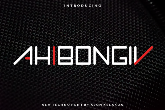
Ahibongiv is a thick, high-impact display font built for clarity and character—not decoration. As a web designer who ships landing pages, SaaS dashboards, and e-commerce experiences, I reach for Ahibongiv when I need a headline to land with intention—not just volume. Its bold letterforms are tightly spaced, vertically confident, and engineered to hold weight at scale: 48px on desktop, 36px on mobile, even 28px over hero image overlays without blurring or visual collapse.
It’s not a font for body copy. And it shouldn’t be. Ahibongiv thrives where hierarchy matters most: hero section titles, product name tags, CTA buttons in conversion-focused layouts, and logo lockups embedded directly in SVG or CSS @font-face declarations. Its thickness delivers instant recognition—even at low contrast or fast scroll speeds—making it especially effective for users scanning content on mobile or mid-page banners in online stores.
In practice, Ahibongiv anchors tone before a single word is read. On a coaching website, it transforms “Clarity Starts Here” from generic to grounded. In a boutique apparel store, it gives a t-shirt slogan like “Wear Your Why” the physical presence of screen-printed ink. For a digital course sales page, pairing Ahibongiv with a neutral sans serif (like Inter or Manrope) creates rhythm: bold assertion followed by calm explanation. That contrast isn’t stylistic—it’s functional. It guides attention, reduces cognitive load, and supports faster decision-making.
Where Ahibongiv Performs Best Online
- Hero sections: Use at 48–64px on desktop, 32–40px on mobile—always with generous line-height (1.1–1.2) to prevent crowding.
- CTA buttons: Works well at 18–22px on light backgrounds; avoid using below 16px or on busy image overlays without a subtle text shadow or background tint.
- Logo text & brand marks: Ideal for monogram treatments or short-word logos (e.g., “Verve”, “Kairos”, “Stell”) due to its strong letter geometry and consistent stroke weight.
- Section headings in portfolios or case studies: Gives project titles gravitas without competing with imagery—especially effective when paired with tight vertical spacing and ample margin.
- Digital ads & social banners: Renders cleanly across platforms (Meta, LinkedIn, X) when exported as crisp PNG or embedded via webfont in HTML email headers.
Readability stays strong across devices—but only when used intentionally. On dark mode interfaces, ensure sufficient luminance contrast (at least 4.5:1 against #121212). On light backgrounds, avoid pure white text on #FFFFFF; a 5% gray (e.g., #F5F5F5) adds depth and reduces glare. For small-screen buttons, test tap targets: Ahibongiv at 18px needs minimum 44px height and padding to meet WCAG touch guidelines.
Smart Pairing for Web Design Systems
Ahibongiv doesn’t ask to be matched with another bold face—it asks to be balanced. Its personality is direct, so pairing works best with typefaces that recede gracefully: a highly legible, low-contrast sans serif for UI text and paragraphs (Inter, IBM Plex Sans, or Work Sans), or a restrained serif (Lora, Cormorant Garamond) for editorial-style blogs or premium brand kits. Avoid pairing with other display fonts, script fonts, or decorative serifs—those combinations fracture hierarchy and dilute brand focus.
For multilingual sites, verify Ahibongiv includes Latin Extended-A support at minimum. Most modern display fonts cover Western European languages, but if your audience includes Turkish, Vietnamese, or Central European markets, confirm glyph coverage before licensing. Also check whether the font includes OpenType features like stylistic alternates or ligatures—these rarely impact web use but matter for SVG-based logo exports or branded PDFs.
Licensing & Technical Fit for Digital Projects
Ahibongiv is a commercial font—and that’s essential context. Using it on client websites, SaaS dashboards, Shopify themes, or downloadable digital templates requires an appropriate license. Free font alternatives often lack web-optimized hinting, variable weight options, or proper EOT/WOFF2 compression—leading to layout shifts, FOIT/FOUT issues, or inconsistent rendering across Chrome, Safari, and Firefox. A licensed version of Ahibongiv typically ships with WOFF2 files (smallest size, broadest support), CSS snippets, and clear usage terms covering domains, subdomains, and traffic thresholds.
If you’re embedding Ahibongiv into a Figma design system or shared component library, confirm the license permits team access and export to dev handoff tools. For agencies building white-labeled products, verify whether redistribution rights apply—for example, bundling the font inside a React component library or a WordPress theme sold on ThemeForest.
Finally, performance matters. Load Ahibongiv only where needed—don’t preload it for body copy. Use font-display: swap in your @font-face rule to prevent invisible text during load, and consider font-weight fallbacks (e.g., 700 or 800) if the exact weight isn’t available. Most display fonts like Ahibongiv ship with one weight—so plan your typographic scale accordingly: one bold display face + one versatile text face = clean, scalable, maintainable typography.
When your goal is to make a digital experience feel unmistakably *yours*, Ahibongiv delivers more than aesthetics. It delivers consistency—across a landing page headline, a product badge, a mobile app splash screen, and a branded email header. That consistency builds recognition. Recognition builds trust. And trust, in digital spaces, is the quiet engine behind every conversion, subscription, and return visit.